CAPimpact Platform
Climate Solutions International
Web/PC
Overview
The CAPimpact Platform helps city governments develop their infrastructure budgets in ways that manage climate risk and find cost effective carbon-zero approaches to reduce emissions. While many people assume decreased carbon emissions requires expensive technology, CSI's work demonstrates that green technology often involves little to none upfront cost increases, but can actually cause large decreases in long term maintenance costs that can be a net boon for the city.
The Ask
Climate Solutions International's early work when we started was an unwieldy, highly technical, and complex system that needed to be converted to a user-friendly, accessible, and collaborative platform.

Senior UX Designer
1 UI Designer
1 FE Developer
Develop a prototype of the core decarbonization flow for pitching to early investors/clients and to evaluate development viability.
Successful fundraising and recruitment of alpha test participants in 10 North American cities.

Project Director
2 UX Designers
2 UI Designers
2 FE Developers
Build upon the initial prototype to include project management, error handling, and report generation to produce the MVP build for alpha testing.
Alpha test launches by end of 2026


Design Goals
Digestible at a Glance, Complex at its Core
Assembling a project's budget is a long, convoluted process. The user should always know where in that process they are, the impact of the choices they've made so far, and what is left to be tackled.
Avoid Oversimplifying for the Ease of Usability
While tempting to follow a model of building to the most common situations and supporting edge cases secondarily, CSI had previously found that technical experts quickly gave up on products that didn't feel comprehensive. An overly clean, minimal interface can actually lose confidence it feels like they're only cherry picking happy paths and scenarios.
Shareability as the End Goal
At the end of the day, any budget produced is useless if it can't get approval as it moves up the chain of command. Making sure that the final product was readable, shareable, and touched on critical data points for decision making was a non-negotiable step of even the simplest MVP.

Major Steps
Understanding the System
CSI has already done extensive work developing formulas and databases to represent the complex aspects of government projects and budgeting. Diving in and mapping out dependencies was critical for getting off the ground when mapping potential flows.
Workshopping Targeted Feel
The final product needed to feel polished and professional, while also rigorous and extensive. We gathered many references including Turbo Tax, energy suppliers like ConEd, and other climate science dashboards as references to identify our final experience targets.
Mapping User Needs
Forcing users to have to deviate from their typical plans by requiring low carbon and zero carbon options added a potential hostility where we interrupt the user's expected flow with extra tasks. We needed to map out what additional questions and uncertainties this produced and how to assuage them without throwing off the user's flow state.

Iterative Wireframing and Prototyping
Based on the research findings, we restructured the overall flow, designed a centralized hub that grows as tasks are completed, and focused on consistently providing updated feedback on user progress and efforts.

Final UI Designs done by Matt Laverty.
Results
The final Figma prototype covered the entire Decarbonization flow and was used as part of successful fundraising efforts by CSI, kickstarting the development of the MVP build of the platform and resulting in the recruitment of alpha test participants in 10 North American cities.
A year later, CSI returned to hire UX is Fine for the second round of the project, Phase 2, and I was asked to direct based on my knowledge of the product, client relationship, and understanding of the system.
Lessons Learned
Build Stakeholder Trust by Getting Your Hands Dirty
Working with a client unfamiliar with product design, I found that the biggest confidence builder was demonstrating I'd spent time trying to deeply understand the product.
Did I need to know how specific HVAC systems work? No. But going line by line through the formulas that would be driving the back end of the system I was going to be supporting helped me show that I wasn't just designing for the simplified ideal scenarios.
It also helped me spot important dependencies that were easy to miss and earn client trust that I was deeply invested in making sure this would be a project that could expand in the future.
Meet the Users Where They Are
Asking government officials to shift their preferred software for a task as huge as project budgeting is a big ask, and they have enough experience to know that just because software looks clean and modern isn't proof that it'll deliver. Even when just focusing on the core flow, proving that we were accounting for unusual situations and edge cases early was critical for buy-in, and transparency at how each choice and step impacted the final result was key.
Project Goals
Establish Clear Prioritization
With the client-side developers mostly working on a volunteer basis, features had been developed haphazardly by each individuals' interest. Clear prioritization, scheduling, and organization needed to be implemented to make sure that the core elements of the MVP would be ready on time.
Leave the Project Better than We Found It
Seeing the results of our first design hand-off, it was critical to address friction points early - to apply UX principles to our processes and not just the designs. We changed how we handed off materials and interfaced with the team to make sure our designs were clear even in the case of more high volume turnover.
No Hand-Waving
Now that we moved from pitching to building the product, we needed to review our previous work with a fine-toothed comb, making sure to address edge cases and error states early and consistently, even if it meant overhauling "completed" work.
Major Steps
Aligning on Priorities
When we returned to the project, there were many features targeted for the MVP but little prioritization. I lead several workshops breaking down epics into design and implementation user stories, and led prioritization efforts to make sure we had a clear roadmap for the team before jumping into the deep end.
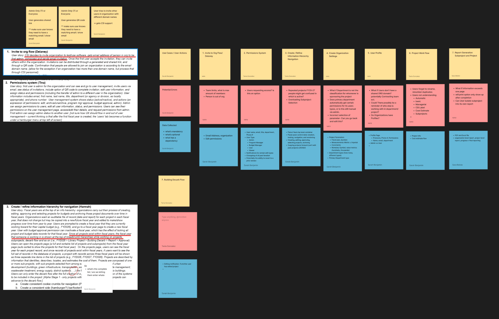
Updated Flows and Systems
Our initial designs were still viable, but building the structure around it for program management opened new opportunities to address dependencies. While my designers were deep in the design specifics, I maintained a high level vision on the user journey to make sure we were maintaining an overall flow that avoided redundancy and streamlined user effort.

Early Alpha Testing
I ran focus group sessions with the alpha test participants and got early feedback around what criteria they would be using for initial evaluations. I also worked with the client separately to develop criteria for evaluation test feedback, to make sure they weren't making large pivots on feedback that was best addressed later on in the process (like a desire for personalized color schemes in exported reports).
Conclusion
Lessons Learned
UX the Process as well as the Product
Great designs can be worthless if the structure isn't in place to implement them. Keeping an eye on how teams are interfacing and structuring their roadmap, and adapting as friction points are discovered, can be what elevates a project over time.
Don't Stay the Only Expert in the Room
When working with clients with less product development experience, you're brought in as an expert but it's critical to make sure the client feels their own confidence in the field grow. Don't dictate prioritization or pipelines - work with the client to establish their own so they build off of it further when the engagement is at an end, keeping the momentum going.