Comparing Vehicles
Providing customers with new tools to help make informed decisions while shopping for their next vehicle.
Overview
My team and I developed a new feature for MBUSA.com that allows users to compare vehicles across dealership lots. The core directive from the client was to ensure that “no car feels like a loser” - that no car looks good because it has made another vehicle look inferior.
The biggest challenge by far was navigating the complex data systems that enable this kind of comparison, and I worked extensively with our development team and product owners as part of this project.
Check out the final prototype - built by me, with designs produced by our team’s visual designer - or read on to learn more about my process.
This work was done in 2022, and a version of this feature launched on the MBUSA website in Q3 2024.

Project Details
Client: Mercedes-Benz USA
Team:
1 UX Designer (Myself)
1 Visual Designer
1 Copywriter
1 Content Manager
as well as a Creative Director, Project Manager, and several Developers
Key Deliverables:
Landscape audit
Concepting and ideation
Wireframes
Usability testing
Prototype
The Challenge
Finding the right car - at the right price - can be overwhelming to the average shopper.
When looking at 4 red SUVs in a dealer’s inventory, it can be difficult to figure out why one costs $15,000 more than the rest, or which one has the features a shopper cares most about.
This is why my team and I started work on a new feature that would allow comparison of vehicles within dealership inventories on MBUSA.com.
Landscape Audits
I started out with a landscape audit of comparison tools in and outside of the auto industry.
Some of the audited experiences included:
Car manufacturers
3rd party car retailers
eCommerce platforms like Amazon, Apple, Staples, and Best Buy
I also pulled references and examples from video games including Outer Worlds, Borderlands 3 (left), Mario + Rabbids, and Dragon Age: Inquisition, as equipment comparison is a common feature that often needs to simplify complex stats and features into a quickly digestible readout that aids decision making.

Areas of Opportunity:
The standard pattern is to remove users from inventory to a full-page readout - we can do better and keep users where they are
When comparing 3+ items it can be hard to identify which one is the “winner” in any given category
Balancing the typical user and power user gearheads who want to know everything
What Works:
Visual elements can relate valuable context and make the information more digestible
Using an in-page expandable drawer serves a double purpose to store vehicles of interest while browsing
My major takeaways from this phase of research was:
Anticipated Challenges:
Data completeness and standardizing formatting
Initial Concept and Wires
My earliest concepts focused on providing light, digestible pieces of information that were relatable to someone regardless of brand familiarity or car knowledge.
Pulling from the landscape audit, I focused on an in-page expandable drawer that doesn’t require the user to leave inventory.

Early on in my wires, I got a central directive from the client:
“No car should feel like a loser”
Every vehicle being compared is a Mercedes-Benz, and the experience shouldn’t make some vehicles look good at the expense of putting down the vehicle next to it.
For this reason, I focused on highlighting the positives, not drawing direct attention to what a vehicle was missing, and including some luxury features that are standard across all vehicles in our lineup so every car is guaranteed a space to shine.

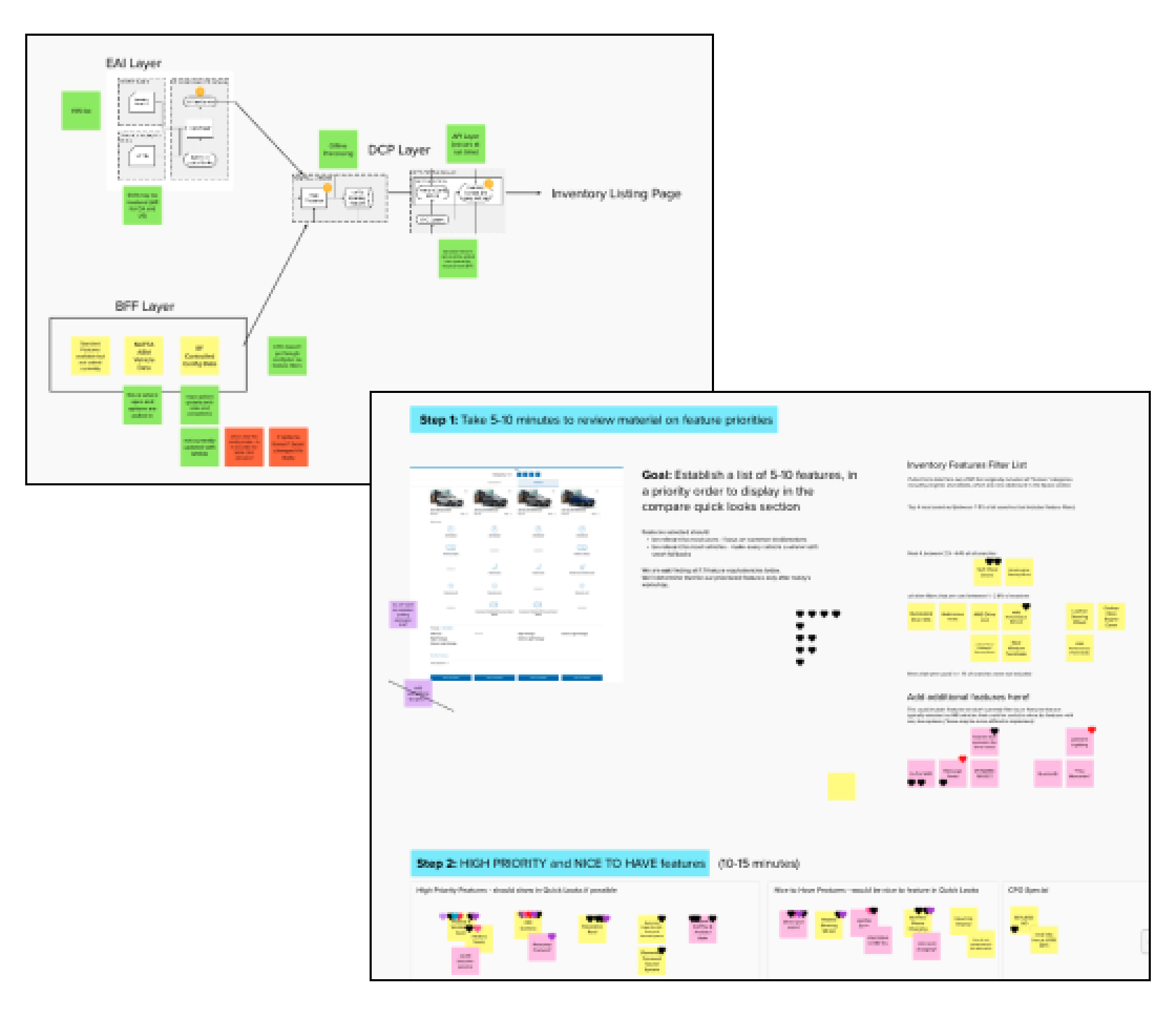
The Biggest Challenge - Data
While easy for a human, from a data perspective, it’s can be quite complex to match similar features across different vehicles.
I facilitated several workshops between our development team, strategists, product specialists, and main clients to prioritize which car features had the right balance of feasibility vs. business value.
Mural was an invaluable tool for getting everyone on the same page, centralizing information, and dot voting on the final result.
Usability Testing
I conducted usability testing using our first round of visual designs, produced by the team’s Visual Designer.
The test included task completion tests like adding and removing vehicles, as well as testing the users’ ability to answer questions and make comparisons quickly, such as “which of these four cars gets the most miles per gallon?”.
I also used the split between desktop and mobile platforms as a chance to do some small A/B testing on elements like iconography.
Here is a selection of our biggest takeaways:

Most users were comfortable navigating through the main flow, but some users - particularly older and/or less tech-savy users - sometimes lost track of the widget or weren’t sure how to open or close it.
Based on the results, we added animations as items are added to the compare drawer, and changed proportions to make the drawer more clearly a smaller component of a larger page.

I tested two types of delta indicators - a blue highlight and a green icon.
Surprisingly, most users didn’t even notice the treatment - but didn’t show any issues answering research questions quickly and correctly.
I decided to remove the deltas entirely, and made some other smaller changes to the information hierarchy based on other user feedback.
Updated Designs & Prototype
Here are the final designs - please note these were designs produced by the team’s Visual Designer, and I have used them to produce the prototype and animations.
If you’re interested in clicking through the full prototype, click here to check it out.
New Widget Animation

Open Panel & View Specs

View Packages & Features

Summary
This project was a major exploration of how to take complex, data heavy systems, and relay them in highly visual, digestible ways.
It was a major challenge in terms of working with development and product owners to balance feasibility against business needs, and to go above and beyond the current standard for similar features among our direct competitors.
It has an immense flexibility for alternate applications throughout our site - such as custom comparisons that include the users’ current vehicle for reference - and plenty of untapped potential for future utilization.